 This sheet provides basic information on how
to use Nengo's interactive plots.
This sheet provides basic information on how
to use Nengo's interactive plots.
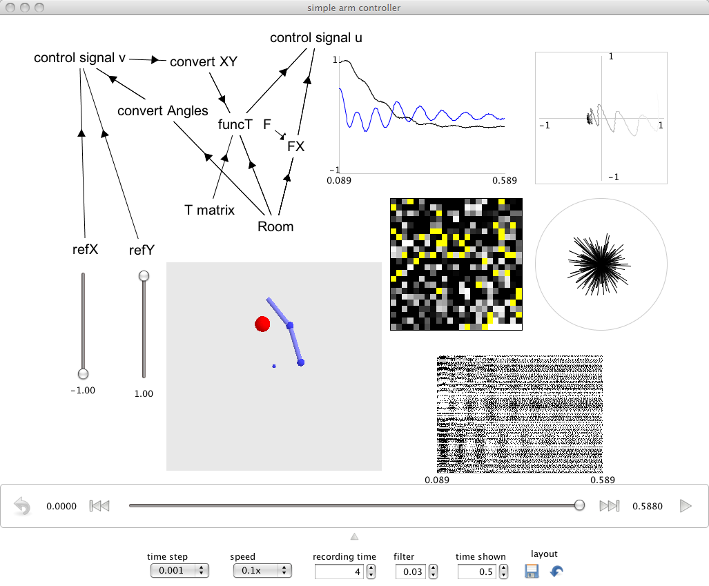
Interactive plots are started by right-clicking on the background of the Network Viewer and selecting Interactive plots from the menu. This creates a window that shows each named population and input. Right-click on these to access controls and plot types (or to hide them). All objects can be moved and resized by dragging. You can grab the background to reposition everything. You can make changes to the network in Nengo while the plots are running.
Controls
-
Simulator controls:
- The simulator controls on the bottom of the screen let you run the simulation (>), move to the end (>>|) or begining (|<<) of simulated data, and reset the simulation (<~).
- The two numbers that count time tell you the length of time currently available for scanning by dragging the slider. If you drag the slider back into this range, the simulation will show data from that point in time. If you press play within this window, it will continue from this point. Once the slider gets to the end of the window, the simulation generates new data.
-
Function input controls
-
If you have defined a function input, it will be used to run the simulation when it first starts.
- If you want to control the simulation manually, right-click the function input and select control. As soon as you grab and move this slider, you will be in control of that input value.
- To use your original input function again, you will have to hit the reset button.
- Usually you want to also select value so you can see what input you're giving.
- To change the range of values, right-click and increase or decrease the range. This doubles or halves the current range.
Kinds of plot
All plots are available for a population by right-clicking the population. There are several kinds and include:
- value. These plots show the decoded values of vector elements, or the set value of function inputs. Any function origin name after the word value (e.g. value: product) tells you which origin is being plotted. value alone means the plot is simply of whatever value is being represented by the population (referred to as X). Right-clicking and selecting label will label the plot.
- firing rate. This plot places all neurons in a square and shows the filtered spike train (see Options for filtering), or the firing rate (for rate neurons) of the population. Right-clicking and selecting improve layout will attempt to order the neurons by their tuning curves.
- voltage grid. This plot is like firing rate except the subthreshold voltage of all neurons is shown on a 2D grid. Yellow dots indicate spikes from the neuron. The layout can be similarly improved. (This is the same as the firing rate plot for rate neurons).
- voltage graph. This plot shows the same as the above, but over time and for only those neurons you select (select them by right clicking the graph).
- spike raster. This plot shows spike times for all the neurons. (For rate neurons it shows if the neuron is active or not).
- preferred directions. This plot is only shown for 2D populations. It shows the preferred direction vector of each neuron scaled by its firing rate.
- XY plot. This plot is only shown for 2D populations or function inputs. It plots the x and y values on a plane.
Options
You can configure aspects of the display by clicking the down-arrow at the bottom of the window. This reveals the following options:
- mode. This is the simulation mode. Default is spiking neurons. Rate is rate neurons. Direct is no neurons.
- time step. This is the time step (in seconds) of the simulation.
- speed. This determines how close to real time the simulation runs. Often the fastest will not be real time; more often it's useful to run the simulations at 0.1x speed or slower.
- recording time. This is the time (in seconds) that data is saved for. Once the simulation has run longer than this time, the earliest data is thrown away. Essentially available data is in a sliding window, and this is its width.
- filter. For spiking neurons all value and firing rate plots are filtered by an exponential with a time constant set by this value (in seconds). This can be thought of as a PSC filtered spike train at a receiving population.
- time shown. This determines the width of the time axis (in seconds) in the plots.
- layout. These two buttons let you save and restore the layout. The last saved layout is automatically restored on load.
Tips
- Any plots representing multiple signals can be right-clicked and signals can be turned on or off if things get cluttered.
- Right-clicking the background lets you re-show populations or inputs you may have hidden.